
Every designer, in every discipline of design, knows this situation. “We really like your portfolio/ideas/style/haircut, so we would like you to be our in-house designer. We are sure you will make something extraordinarily special and great every time we give you a design opportunity!” After feeling seen/flattered/a little sus, it turns out the second part of the request is something like: “At the moment we do not have any budget, but we expect this label/product/hot air balloon to blow up in the coming year. So you have the honor to be part of this spectacular sensation. For free!”.
There is no money, not much time and they said really nice things about you before they could suspect you would feel a slight hesitation about the working for free part. I used to think it was a great opportunity to try new things, or even new tools, or that diet where you don’t have time to eat for eight hours, and then fast the rest 16 hours.
Turns out you start to feel a little light in the head after 10 years of too little food, too little sleep and too little time, all of the time. And no compensation that makes it all worthwhile in retrospect. Well, you learn a lot along the way, and sometimes, after incidentally falling asleep and somebody force-feeding you something nutritious, you get a bright idea.
Let them eat cake
It was more complicated than that, but a subheading should be short. The long version: if they don’t have money to buy my cake, let them bake it themselves, with a recipe they buy one time.
In actual graphic design context, I create a template that is easily adaptable and hacks a correction layer in Photoshop to have the result look different every time, without me. And as bonus I will include a slew of flavorings you can adapt yourself, to have infinite different designs. Theoretically.
The show must go on
Ok, I have used this technique for music labels mainly, because that is a world where branding is important, you need a high-quality consistent look. Every label wants to be able to appear next to the big players on Beatport, Spotify, Apple Music etc and look equal. The players that can pay designers enough to
With quite some experience in my backpack, I know I can create a nice look, and with this approach I can throw it over to them and let them have their way with it. “Enough talk, we want pictures!” I hear the masses chant outside of my ivory tower.
Lifting Force Music is a label built on the love for trance music, by Tycoos and Badma, who I also work with for Abora Music. I showed a way to have an adaptable template earlier. Around ten months after the start, they asked for a visually more interesting design for the releases of the label.
The design is pretty minimal if you look at the basis. A simple illustration of a plane, in this case, a paper plane. Because it is a genre of music that is made and enjoyed by people who like to be taken away to an experience, music that lifts you up, and always has a human touch. (this is a post-hoc rationalisation of something that starts as a conceptual idea that just feels fitting)
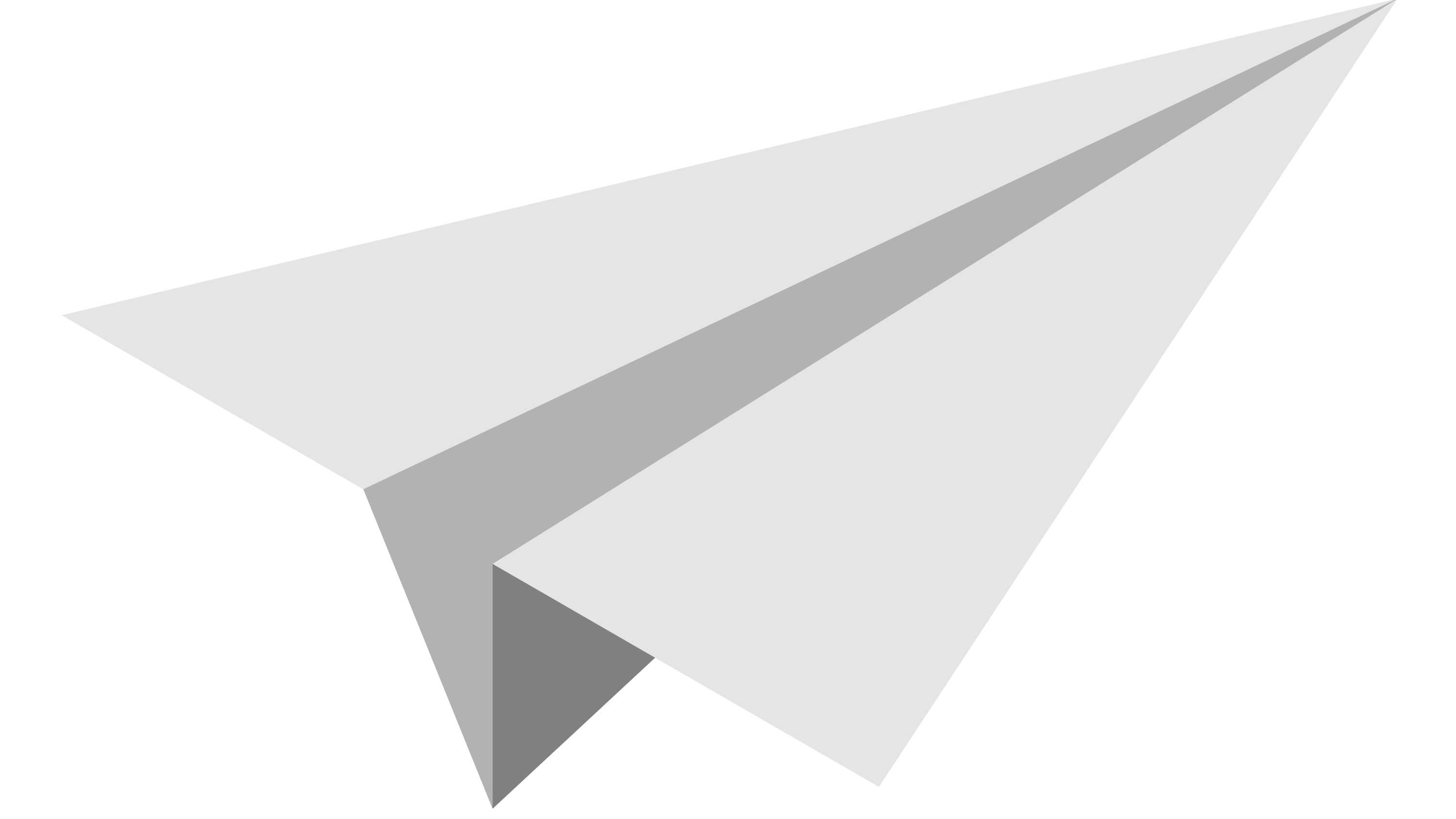
I love how just three elements and three shades of grey can depict an object that feels like something with dimensions. And it is really just three elements.

The basic illustration is made in Illustrator after that we go to Photoshop, to add gradients to the large surfaces and to a couple of well-placed lines. This gives the paper plane illustration weight and dimensionality. Because of the specific way I make the design easily customizable, I know which range of grays I want to use. And that also is the reason the track title is a specific shade of grey.

To breathe more visual life into it, I added aluminum texture to the different parts of the plane, a cloud texture for the background and a shadow of the plane on those clouds. And a glare and flare to have it shine even more

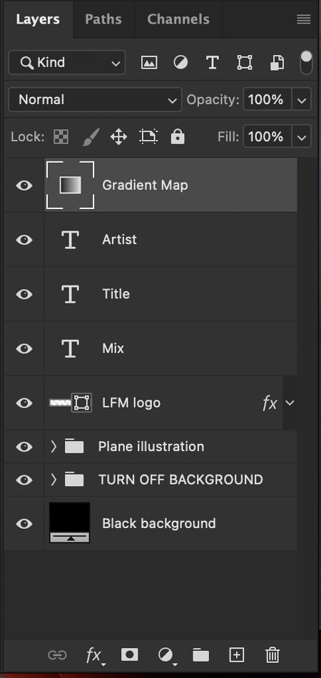
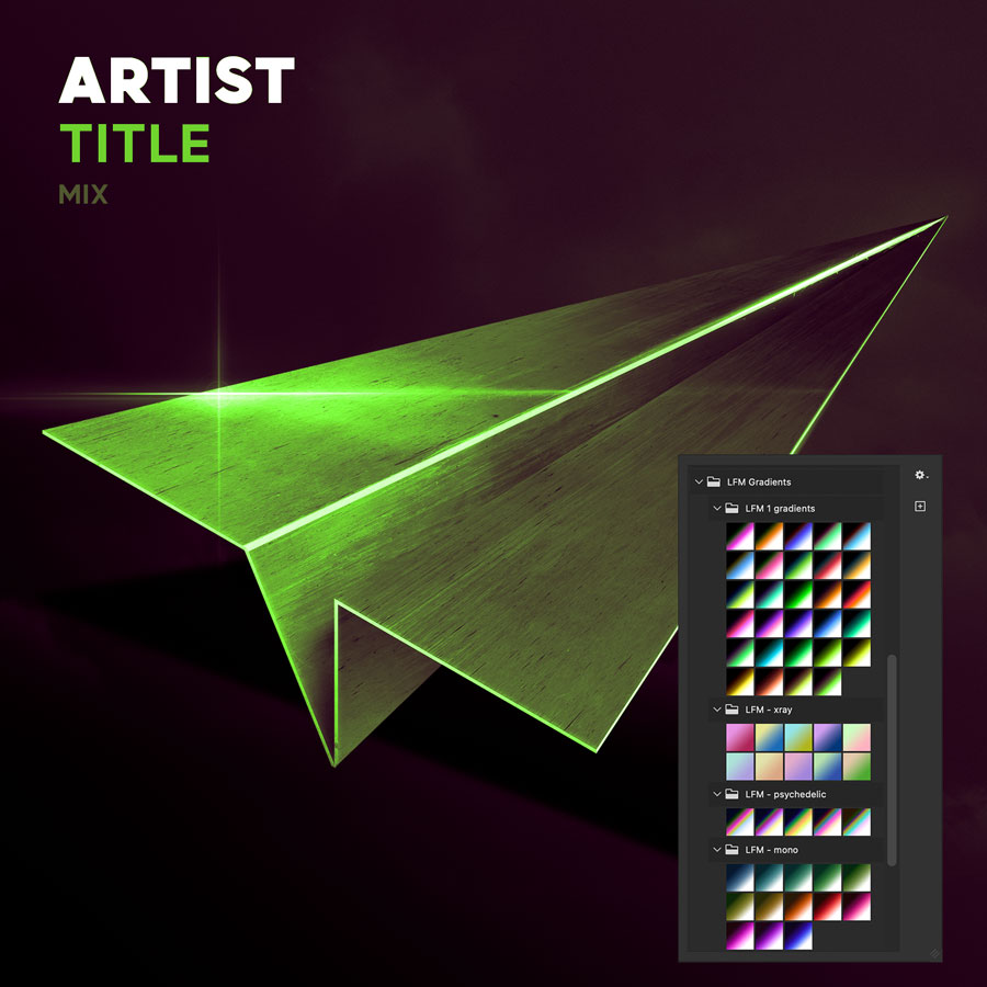
These are the Photoshop layers in the template. All Lifting Force Music needs is a copy of a recent version of Photoshop, and a couple of minutes of time. Double-click the text layers to type the right information. And double-click the Gradient Map to choose a gradient. Because that is where the magic happens.
The gradient map layer has been in the software for quite some time, but the new “Perceptual” gradient mode makes this look much better than the options that were available before. That is why a current version of Photoshop works best.

The basic idea of mapping a gradient to the grey values in the illustration, is that every grey value gets mapped with the color value from the gradient.
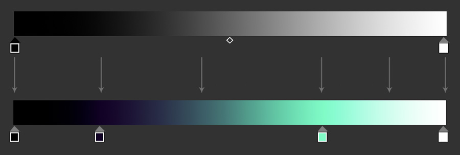
So when you choose another gradient, all the colors change with it.
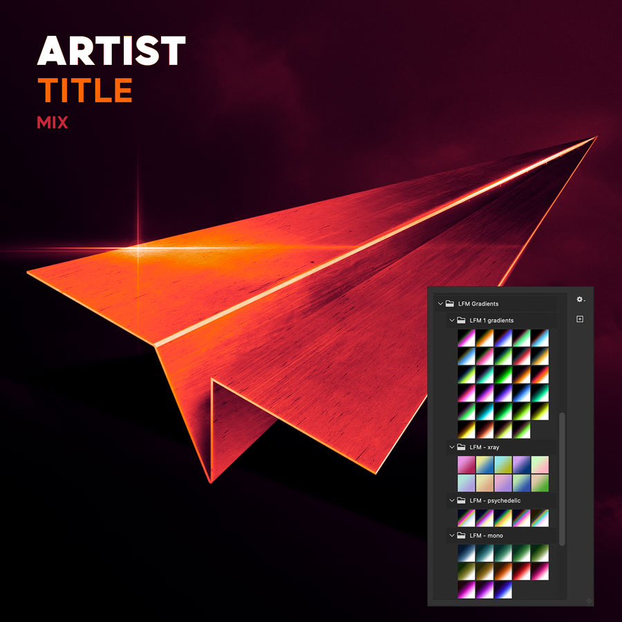
In the gradients I made for them, there are always two colors (though I also did monochromic ones for releases that needed some kind of distinction). A tint in the dark areas, and another in the lighter areas. Because of the textures I added earlier, you still get a visual that is has multiple colors, so it is not too boring, without the need to create overly complex gradients and plenty of variation.

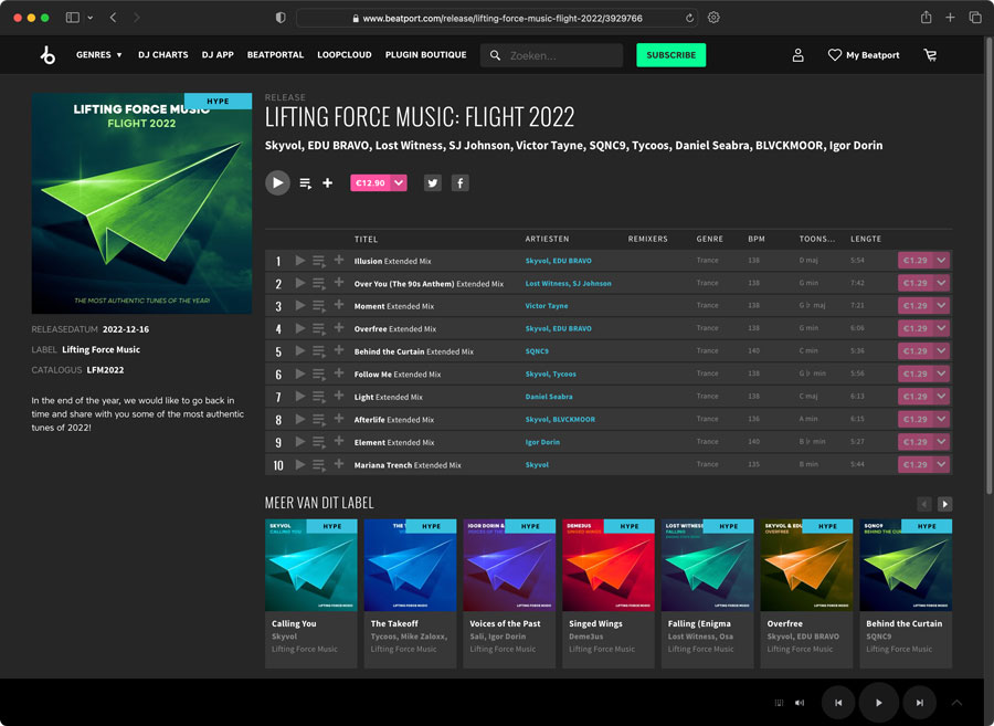
You can view the results on their Beatport page.
I have used the same idea for another young label I provided a similar concept and template, though it looks completely different. In this design, the label owner can drag and drop an image from Pexels in a smart object, that will leave some of its original colour, but also takes tints from the gradient map. That way the colors of the large logo, the text, and the background photo, stay in harmony. This template temporarily went from low-budget to no-budget, but I trust it will be alright after the summer.

